Try Helvetica
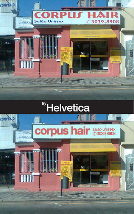
As a Swiss graphic designer, I didn’t really have a choice but to love Helvetica. It is indeed a well-balanced font, extremely readable and elegant, and for that reason I use it a lot.
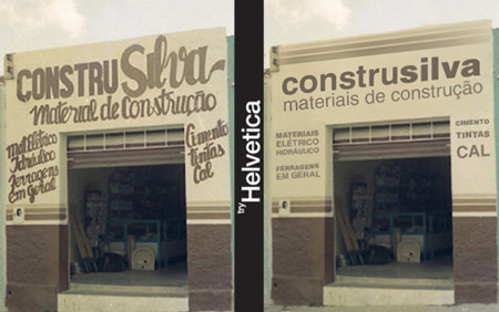
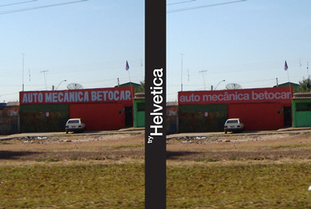
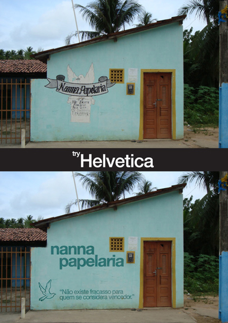
This said, I find that the Try Helvetica shows the limits of the font. The project takes little brazilian shops and replaces their typography with Helvetica, the result obviously looks much cleaner and readable, but it’s not better in my opinion, the designs lose all the warmth and friendliness.
To summarize my thoughts on this, I think that using Helvetica for small brazilian shops is a bit similar to using Comic Sans for a bank’s annual report.


 August 11th, 2011
God no. Please don’t fall into the Helvetica cliche. I don’t know how things are in Brazil, but in Europe every uncreative designer needs to use helvetica, because it’s a safe choice. It’s boring and dull, terrible for the design.
NO HELVETICA!! I love helvetica but it just reminds me of the unimaginative european mind. Even if it looks awful do it at least it’s memorable and not just mediocre looking. At least make an impression good or bad. don’t just blend in.