

205TF: Helvetius by Matthieu Cortat
 June 8th, 2017
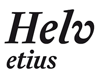
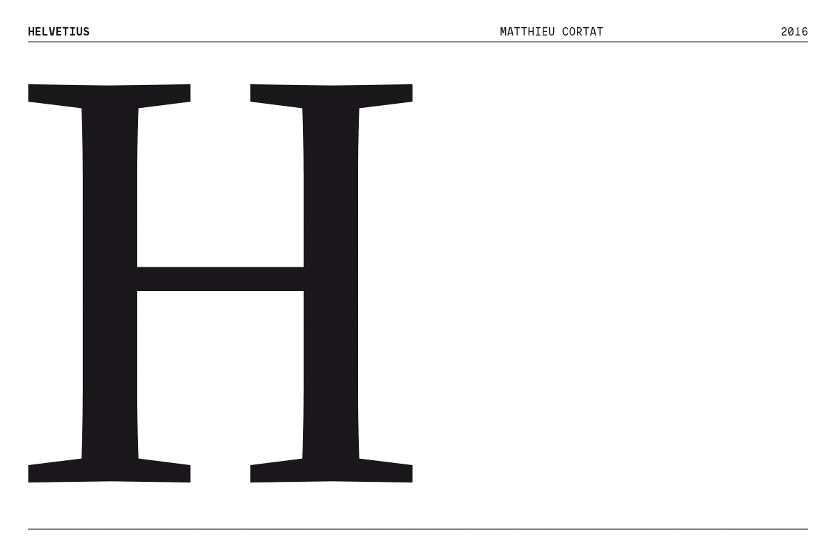
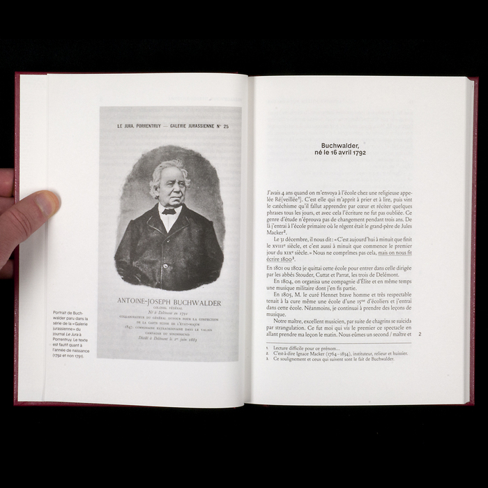
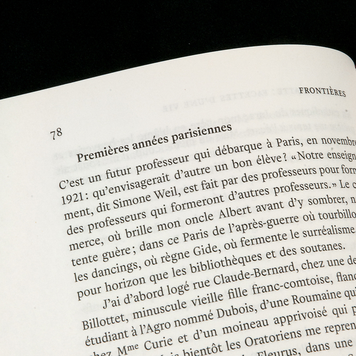
Helvetius is a reinterpretation by Matthieu Cortat of a font used in a 1778 edition of De l’homme by french enlightenment philosopher Claude-Adrien Helvetius. The title page of this book states that it has been printed in London.
As for many of its kind, it’s probably a fake address, often used by French publishers of that time to get rid of censorship. The type itself is clearly influenced by the style of Fournier Le Jeune. Its italic, though, is definitely playful. Those features are kept in the classical yet sensitive digital revival. Slightly condensed, with a large x-height and two extra weights, it fits perfectly any jobbing work in search of accuracy, classicism, but personality and warmth as well. A typographical “petite robe noire” which makes parisian women classy even for everyday life.
Typeface Helvetius is available on 205.tf
No Comments⊕ Add a comment
No comments yet.
Leave a comment