

Oi! A free typeface for loud designers
 December 5th, 2017
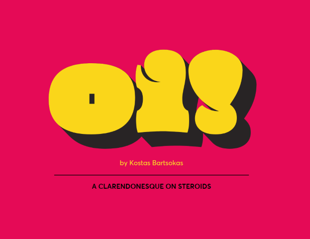
Oi! is an ultra-fat display typeface that has its roots in grotesque slab serifs, most specifically the style that sprung with the release of Caslon’s Ionic in 1844 and Clarendon by Fann Street Foundry in 1845.
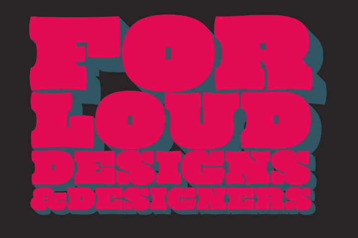
Oi! is a free spirited twisted interpetation of the clarendonesques. With an unapologetic tendecy for public shouting, it is a whimsical loudmouth attention seeker!
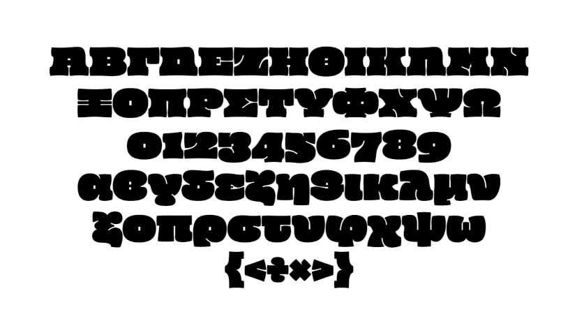
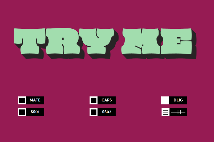
Oi! supports Latin and Greek and comes in two styles. Oi! You!, the regular style, and its accompanying Oi! Mate!, a shadowed style that adds a third dimension to its playfulness.
No Comments⊕ Add a comment
No comments yet.
Leave a comment