

New Font: DIN Neue Roman by Philip Lammert
 January 24th, 2018
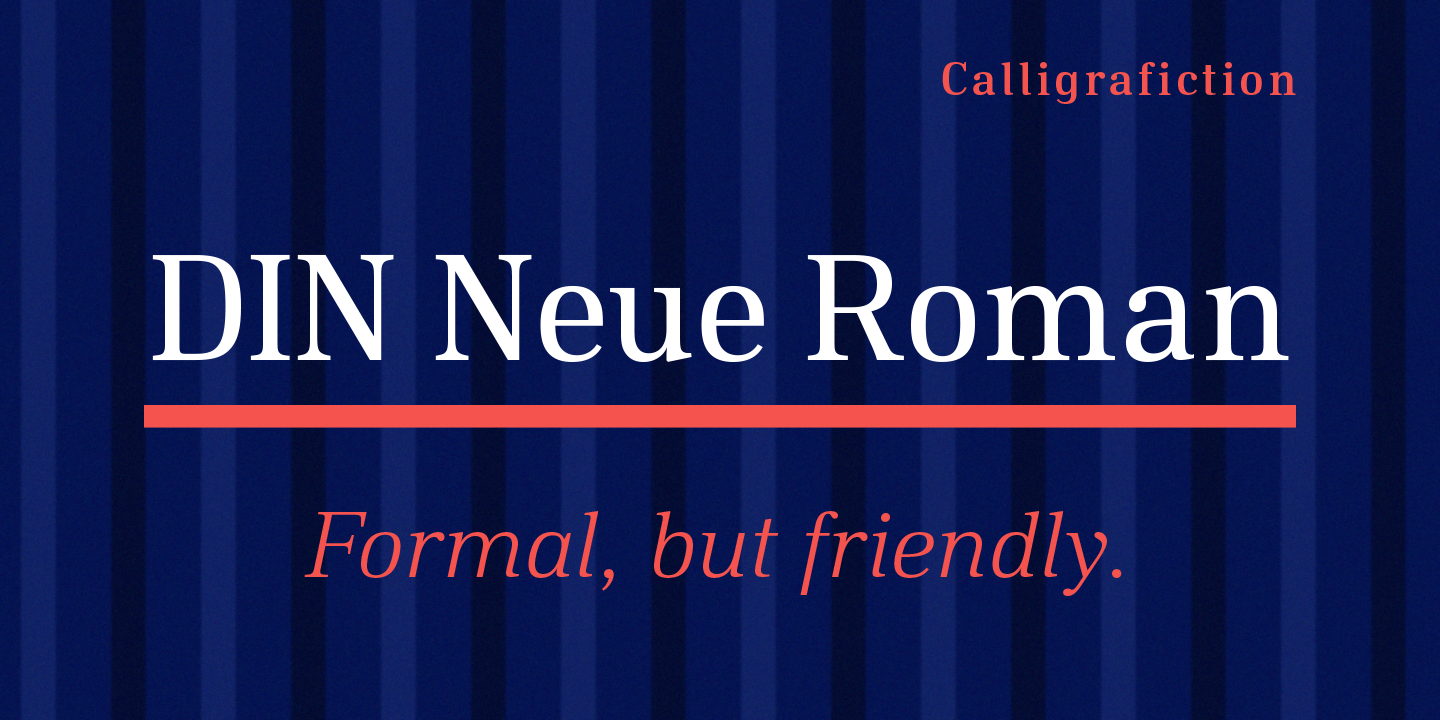
The Calligrafiction Type Foundry has released the typeface DIN Neue Roman on 22 January 2018 commercially. Typeface designer Philip Lammert designed it as early as 2015. It was part of his master thesis at the HAW Hamburg in the Communication Design M.A. course with Prof. Jovica Veljovic. Subsequently, Lammert optimized the font family and extended its character set.

DIN Neue Roman adds something new to the technical origin of the typeface DIN 1451. The sans-serif classic gets a serif counterpart that breaks with convention while preserving its readability. The industrial impression of the static basic principle becomes a little friendlier. Actually, the rigid stroke of a Didone (cf. Bodoni) would be expected here. Instead, the letterforms receive the dynamic stroke of a Transitional (cf. Times). And if relating to DIN a low stroke contrast would seem natural, a much higher contrast is applied here.
Designer Philip Lammert finds great potential in opposites. That led him to this typeface draft that combines two essentially different classics—the DIN 1451 and a serif typeface like Times New Roman. In the design process he has not taken the liberty to loose the concept of DIN. The strength lies precisely in the historical reference and the consistency, with which alleged contradictions are brought together. The result is not an experimental hybrid typeface but suitable for body text. His master thesis Lammert did write on “the hybrid in typeface classification”.
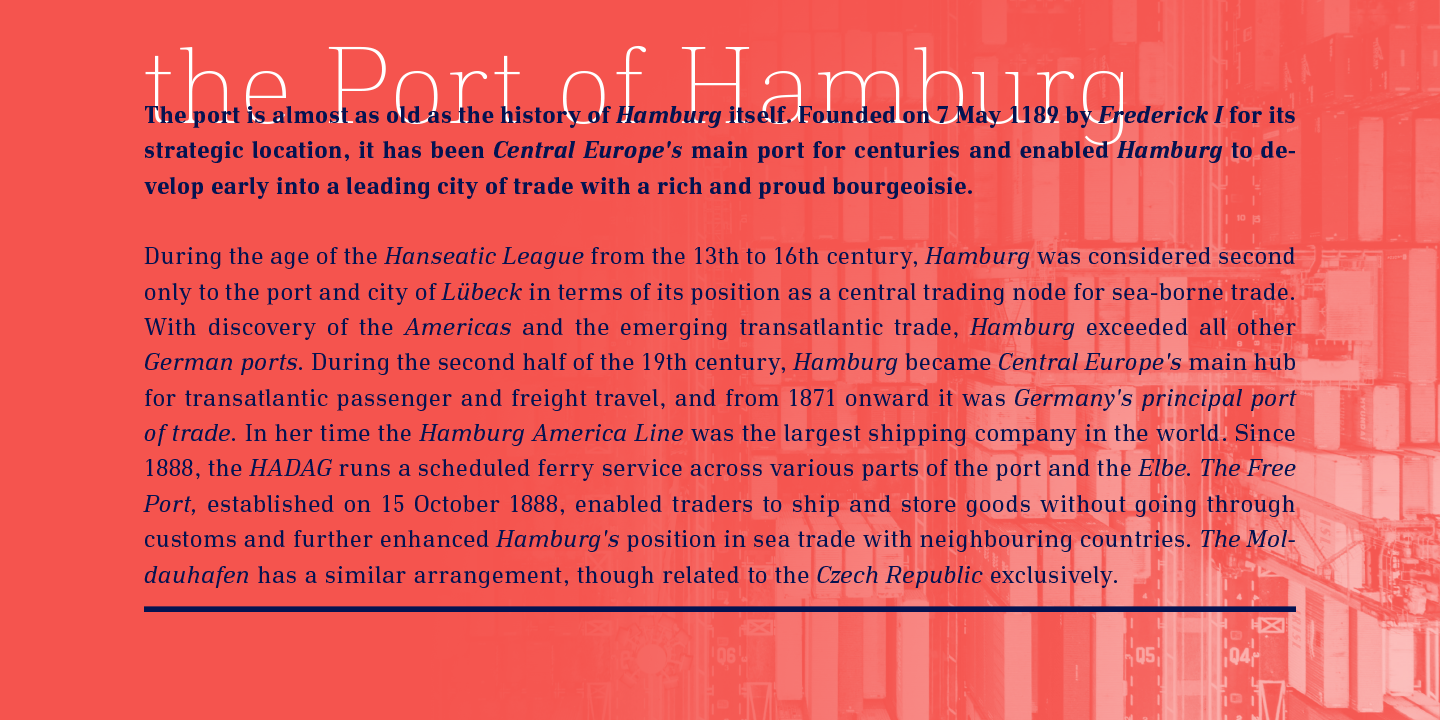
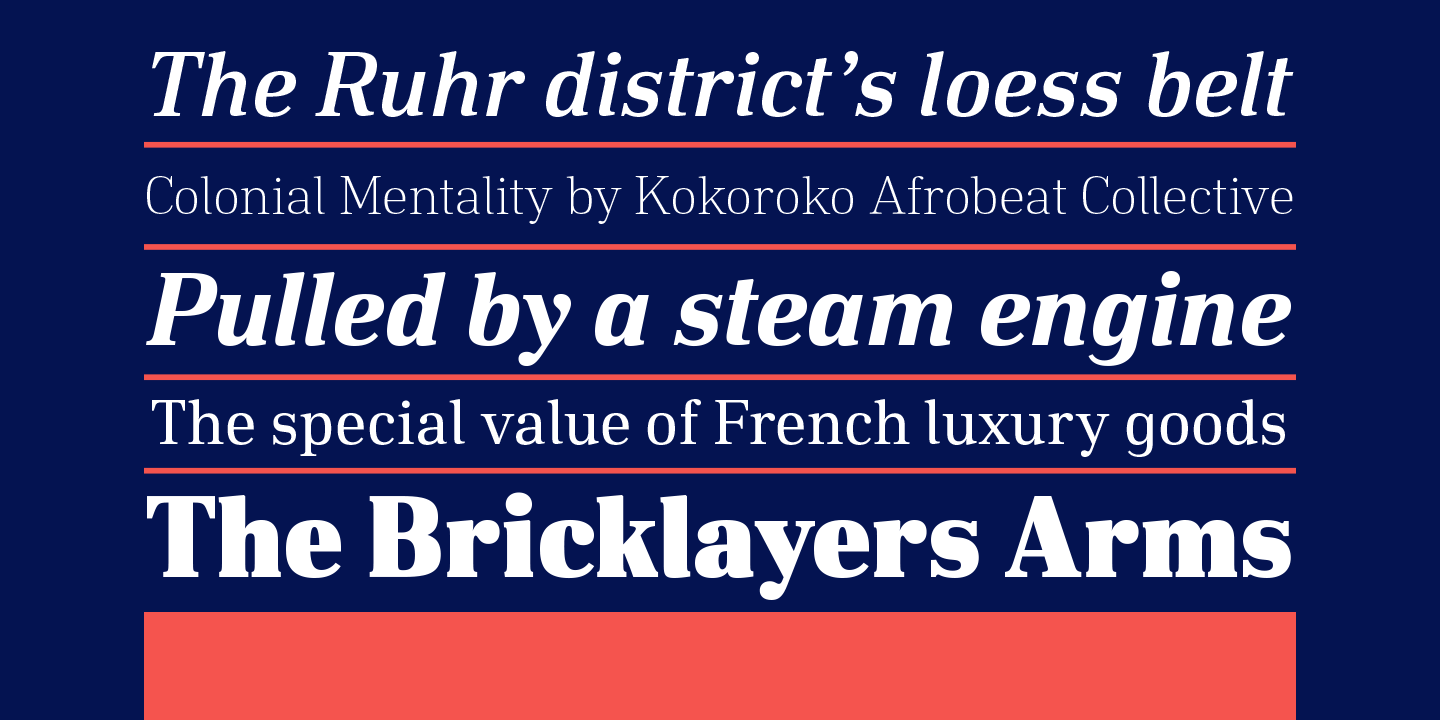
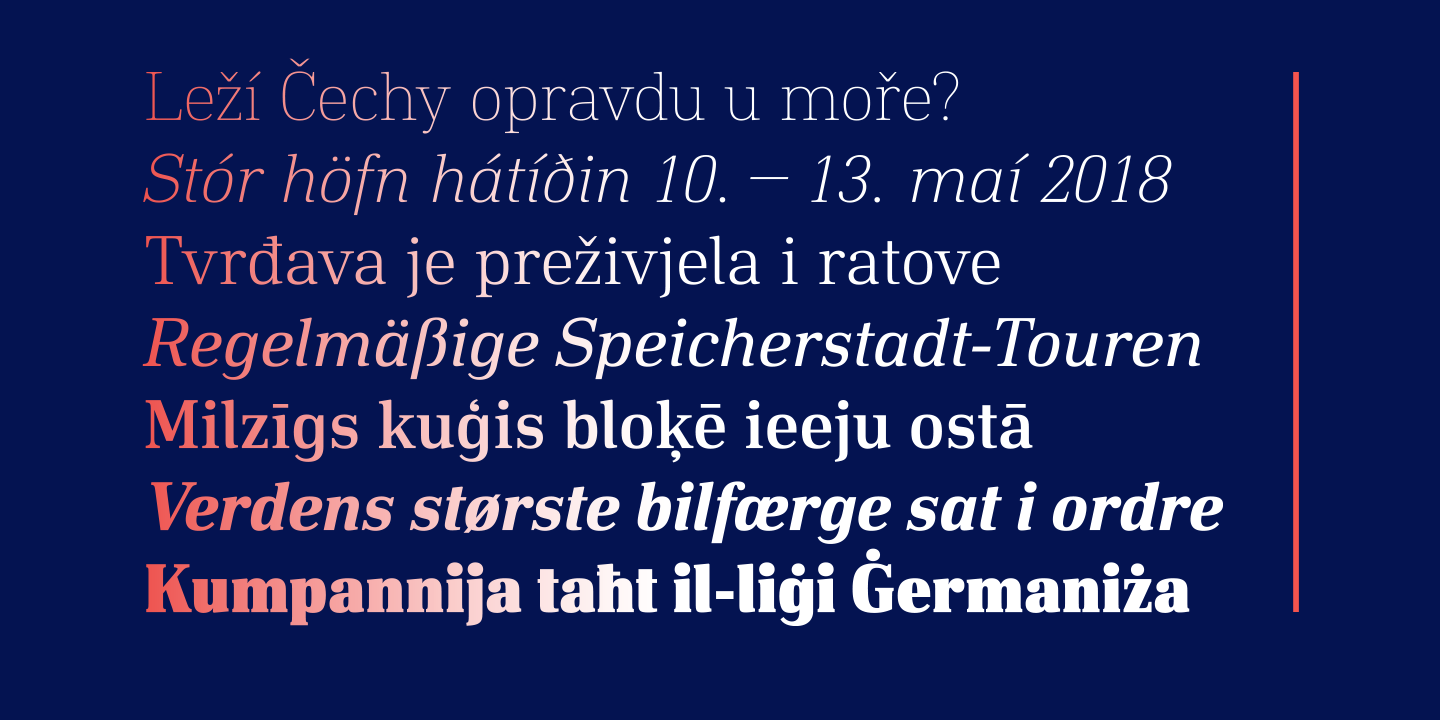
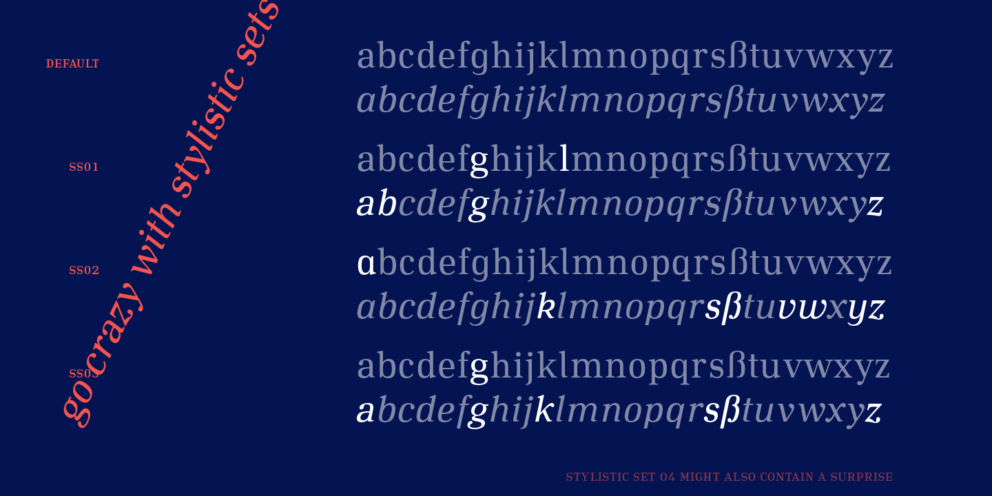
To have enough resources for diverse and complex typography, this typeface family offers seven weights with italics, small caps and many OpenType features. Each font contains over 700 characters. The entire family costs $329, a single cut $46. Until 25th February 2018 there will be a 40% introductory discount. The font can be purchased on MyFonts.

No Comments⊕ Add a comment
No comments yet.
Leave a comment