

Ten Great Typographic Logo Designs
Flash and extravagance aren’t always the best way to make a logo stand out. Sometimes, it’s the simplest, least-extravagant designs that allow companies to really convey a message through their logo and stand out from the crowd.
Typographic logos – logos that only make use of text in their design – hold a special place in the logo design business. They challenge designers to be creative and unique while at the same time working within a highly minimalist design.
If you are looking for inspiration for a typographic logo that you are designing, check out these ten great typographic logos from companies that have used the design to its fullest potential. You’ll also check out LogoMyWay to start a logo contest and browse some of their amazing logo designs.
MailChimp
![]()
MailChimp’s logo features a classic, handwritten design that perfectly matches the company’s fun and friendly nature. Given that MailChimp is an email marketing company, their handwritten logo also plays on people’s nostalgia for handwritten letters. MailChimp’s logo suggests to potential customers that using MailChimp will allow them to create marketing emails that are as personal and effective as the handwritten letters of old.
Visa
![]()
Visa’s current logo is as simple as they come, featuring a single, solid color and a text-only design. However, it is the customized typography of the logo that sets it apart. Since the logo’s original iteration, Visa has kept the same typography for the logo, making for a design that has grown to be immediately recognizable in spite of its simplicity.
FedEx
![]()
Few logos make better use of white space than the FedEx logo. At first glance, this logo may seem like a standard typographic logo. However, if you look closely at the logo you’ll notice a perfect arrow pointing forward formed out of the white space between the characters. This subtle message within the logo’s simple design is truly one of the best examples of how to make a typographic logo unique and recognizable.
Action on Hearing Loss
![]()
The logo for the Action on Hearing Loss organization makes beautiful use of underlining and strike-throughs to convey a powerful message. By underlining the words “Action on Hearing” and striking out the word “Loss”, the organization is able to convey the message that they focus on improving hearing and eliminating hearing loss. That’s a big point to get across for such a simple logo, but the Action on Hearing Loss logo does it perfectly.
Killed Productions
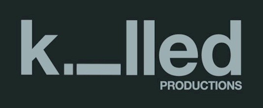
The logo for Killed Productions is nothing short of creative genius, managing to create a scene using only text. By turning the “i” in the logo sideways, the Killed Productions logo makes it look as if that character has been killed. It’s a brilliant nod to the name of the company and a great example of thinking outside the box with typography.
TicToc Clocks
![]()
Like many great typographic logos, the logo for TicToc Clocks manages to embed a meaningful image in the logo while still using only text. In the case of the TicToc Clocks logo, the image is that of a clock’s pendulum made out of an “I” and an “O” that extends down the logo. When combined with the golden color of the font, this image really works well to make a simple design look classy and sophisticated.
V&A Museum
![]()
Sometimes, the simpler a design is, the more complex it is to create. The V&A logo – said to be one of the greatest designs of the late Alan Fletcher – takes this combination of simplicity and complexity to its fullest potential. The “V” and the “A” in the logo mirror each other and are separated by an ampersand that also creates a subtle crossbar for the “A”. Using just three letters of text, this logo is able to pull off a unique and brilliant design. If that’s not an example of how much room for creativity there is within simple, typographic designs, we don’t know what is.
Upside Down Productions
![]()
Turning the characters in the logo upside down may seem like a natural choice for a company named Upside Down Productions. However, doing this in a way that is still easily readable at a glance is a real challenge. By making use of a creative font, though, Upside Down Productions was able to design their logo in such as way that every character in the words “Upside Down” are indeed upside down, but not in the way you might imagine. If you look at the logo, you’ll notice that some of the characters appear upright, but all of the characters that appear upright could also be a different character that is upside down (for example, the first “u” could be flipped into an “n”, the “p” into a “d”, and so on). The fact that Upside Down Productions was able to create an entirely upside down logo that is still readable at a glance really is a stroke of creative genius.
Artists United
![]()
Being an organization for artists, Artists United was no doubt expected to come up with a creative, original logo. By combing the “A” in “Artists” with the “U” in “United”, Artists United was able to create a typographic logo that features the image of a pencil at the logo’s forefront. It’s a great example of creating a meaningful image using only text.
Cadbury’s
![]()
Arguably the king of typographic logos, the Cadbury’s logo has certainly demonstrated plenty of staying power; since it was first introduced in 1921, the logo has undergone little more than a few tweaks, giving it almost an entire century of relevance. This logo features a flowing, complicated, cursive design where the first character in the logo looks like one of the company’s famous Cadbury eggs.
Conclusion
Limiting yourself to only typography when designing a logo is sometimes a risk, but when done right, the minimalist beauty of a great typographic logo is really something to admire. Though all of the logos on this list feature only text in their design, each one is still unique, meaningful, and memorable – and that’s all that you can ask for in a great logo.
No Comments⊕ Add a comment
No comments yet.
Leave a comment