The Roboto controversy

Android 4.0 “Ice-cream Sandwich” is out, officially launched with a new look and tons of new features. Engadget has a post that let you know more about all these new features. It’s a great day for Google and all Android fanboys, except…
Except the accusations of thievery that have been thrown at Google’s face. First, they have been accused of stealing many functionalities or user interface features from iOS, WebOS or Windows Phone. Second, the point that will interest the typographers more, it seems that their new exclusive font, Roboto, is not that exclusive after all.

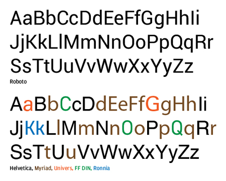
Side-by-side comparison of Roboto and Helvetica created by John Gruber of Daring Fireball.
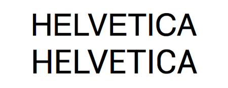
Stephen Coles argues that Roboto is a mashup of four fonts: Helvetica, Myriad, Univers, FF Din and Ronnia. In another article, Michael Degusta of The Understatement tells us that the fonts is only a rip-off of Helvetica. He demonstrates it with an animated gif that overlaps the two fonts, and you have to admit that the result is quite disturbing.
I guess we can safely say that Roboto is Google’s Arial. Too bad, I really like the Android project overall, but this should be fixed. It will be interesting to see what happens if a lawsuit is filed against Google.

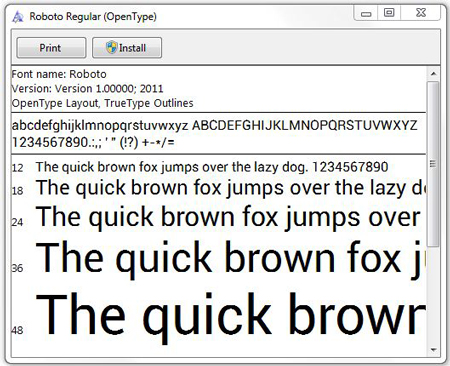
If you want to check out Roboto anyway and test it out, you can do it here.


 October 19th, 2011
The designer Christian Robertson has already announced forthcoming “fixes to minor kerning issues and some diacritical misalignments.” I actually think it’s not so bad and the fixes should make it a viable choice.
Really? Artists borrow from artists all the time. It’s clearly different from Helvetica, the lineups are terrible, the font is more cutoff, it’s more filled out than din, it’s a is squarer than universe. I really think this is just someone applying the theory that if Google stole one thing, they stole everything.
@creativemoore: Glad to hear that, but the real topic is whether the font is a rip-off or not.
@Geoff: Take a look at the animated gif linked in the article, it’s the one that makes the strongest case for a rip-off.
All grotesks are Helvetica rip offs, right?
@kwyjibo: Nope, some are Futura rip offs 🙂
The font theft doesn’t bother me nearly so much as reading the words ‘stolen functionalities’
Nothing says advancement like ‘Hey I made that great UX first, so you can’t.’
Really? We’re at this point? Where we can’t work together to create great experiences and instead limit our advancements by being greedy?
From reviewing the animated GIF (thanks for the link), I don’t see the case holding any water. The x-height on Helvetica is noticeably higher than that of Roboto and the counters of the lower case “q” and “p” (and others) are squared off in Roboto.
It’s about the minute details, the nuances to provide distinction between type families.
Besides, imitation is the highest form of flattery 😉
kwyjibo:
Akzidenz-Grotesk was originally released in 1896 under the name Accidenz-Grotesk. It was the first sans serif typeface to be widely used and influenced many later neo-grotesque typefaces after 1950.
Even Helvetica which was released in 1957.
Futura is not a grotesque typeface. It is a geometric-sans from 1927.
Google did nothing wrong. They made a typeface using influence from earlier faces…always done. Most “new” typefaces cannot compete with classical design.
If we give Roboto flak for being a Helvetica rip-off, perhaps we should give Helvetica flak for being an Akzidenz-Grotesk rip-off?
We may also remember that US Copyright law does not apply to typefaces. Only the computer code (font files themselves) are protected, not the design.
So:
– It’s not a crime to iterate on an existing typeface. It’s actually done all the time in the type industry. Try to overlap two grotesk fonts and you’ll get something “damning” most of the type.
– Roboto does have characteristic features. A more “squary” feel to most letter shapes (works with the robot/droid theme I guess), some tentative legibility improvements.
– From what I’ve read, most people arguing that the font is inherently bad (as did Gruber) did not argue this point in any convincing manner. Stephen Coles argues that “Roboto is cobbled together from unrelated styles” but the letter-shapes seem significantly different between Roboto and the allegedly copied fonts, and when looking at text set in Roboto I get a coherent feel.
Helvetica: often imitated, never duplicated?
I get that the gif you linked makes a convincing case, but when I look at the fonts *next* to each other? They clearly aren’t the same typeface. The letterforms are narrower, the terminals are more angular, and the kerning is tighter.
As far as the font combining “Helvetica, Myriad, Univers, FF Din and Ronnia”…find me a modern typeface that doesn’t resemble another typeface that already exists…I dare you.
We’re not reinventing the wheel here.
I wonder how many hundred fonts you could do that with?
I suppose that somehow CompuGraphic’s Triumvirate is less a ripoff of Helvetica than Roboto?