Intel Clear: a new corporate font for Intel

Intel recently announced a new font built just for its brand: Intel Clear.
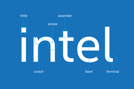
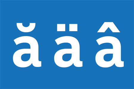
The new font was developed by Red Peak and Dalton Maag. Subtle changes are designed to make it easier to read. For example, Intel Clear’s characters have more even proportions, rounder features and square dots when compared to the old typeface.
Intel’s logo, which doesn’t feature the old typeface, won’t be changing. However, Intel Clear incorporates many elements of the corporate logo to ensure the two complement each other. The font will be used in all corporate communications, such as on its website.


 April 7th, 2014
No Comments⊕ Add a comment
No comments yet.
Leave a comment