

Type Design essentials for Graphic Designers
 December 15th, 2017
DigiGrotesk was designed in 1970 specifically as a first project for
the Digiset machine, by the company of Dr. Ing. Rudolf Hell, inventor of the machine.
The icons of the digital revolution in type design and how their legacy affects the contemporary
Type design and visual communication — or graphic design, as most people call it — are intertwined. Even though the need to express one’s message in a brief and concise way has led to the birth of emojis or emoticons and a wide range of universally interpreted pictograms, letter shapes are still the fundamental medium for the message. It is truly essential for graphic designers to comprehend the basics of type design in the same way as it is for an auto mechanic to know what goes on in the combustion chamber of a car’s engine.
1. How it all began
In the 1960s, there was something in the air. The transition from traditional cold metal typesetting (the name refers to setting the text after casting the individual types) to hot setting (in opposition—the text is set prior to casting the type) that was happening over prior decades resulted in rapid advancement of technology, and modernized systems started to come one right after another. For example, Intertype’s first Fototypesetter (1956) machine, based on their casting device, used light to project prepared text from negative matrices onto film material. IBM’s Selectric (1961) was a sophisticated typewriter that allowed for the rapid exchange of typefaces in the written document and more1). The first true digital system was introduced in 1966 when German inventor Dr. Ing. Rudolf Hell presented technology using cathode ray tubes (CRTs) to project images onto a screen, exposing predesigned typefaces onto a film negative. This device was called the Digiset and it could image 1,000 characters per second! The significance of this invention lay in the CRT bulb. A glyph was no longer a physical object stored in a matrix form of a metal cube or film negative. A character became a set of 2,000 pixels. That meant that the thought and concept of a designer became a string of ones and zeros!
2. Hermann Zapf and Gudrun Zapf von Hesse – the first professional digital fonts
“The letter’s indwelling wealth of form is a fresh, unending astonishment. As there are many splendid types of earlier centuries that we still gladly use in printing, it may perhaps be asked why new types are designed. Our time, however, sets the designer other tasks than did the past. A new type must, along with beauty and legibility, be adapted to the technical requirements of today, when high-speed presses and rotary presses have replaced the handpress, and machine-made paper supplanted the handmade sheet.” (Manuale Typographicum, 1970 M.I.T. Press, Cambridge, MA, p. 3)
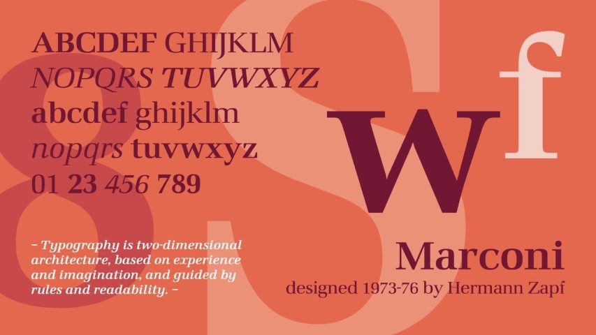
Marconi, designed by a great German calligrapher, typographer and type designer Hermann Zapf, is the first professional type design project in the digital environment – resulting in creating a string of data rather than a physical object.
The quote above comes from the preface of the Manuale Typographicum—a book by the first iconic designer showcased here. Hermann Zapf grew up in the troubled times of interwar Germany in the early twentieth century. Due to his beliefs and his father’s political affiliations, Zapf could not pursue his dream career of becoming an electrical engineer. Thanks to this, the world can now appreciate his amazing calligraphic works and the first properly designed digital typeface—Marconi Roman. Zapf began a cooperation with Dr. In. Rudolf Hell GmbH in 1973. As he mentions in his book Alphabet Stories, at first, the design process was very time-consuming, as he had no experience with the different way of working. The letters were drawn with white paint on a black-coated raster sheet to reflect the pixels mentioned earlier. Although the first release was in 1973, the perfecting and updating the design went on until 1976. Furthermore, there were three more typefaces—Edison Roman, Digiset Vario, and Aurelia Roman.
Zapf also consulted for the Rochester Institute of Technology in 1976/1977, introducing the first program of typography and type design for digital environments, supplemented with an advanced calligraphy course. Hist most iconic designs are Palatino and Optima and a broad range of calligraphic scripts with Zapfino as his prime example.
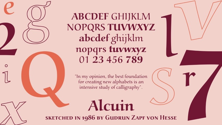
Alcuin typeface has a strong calligraphic character. Gudrun Zapf von Hesse was deeply
engaged in this kind of craft. Alcuin was her first project that was meant for a digital environment.
It is meaningful to separately mention Zapf’s wife, Gudrun Zapf von Hesse. Not only was she a great designer, but one of the first women in the field of digital type design. Before she met Hermann, she taught lettering at the Städelschule in Frankfurt. Her first typeface, Diotima, was commissioned in 1951 by the Stempel AG type foundry. Zapf von Hesse actively participated in the early stages of digital type design, working on such projects as Alcuin (a text face closely related to the carolingian minuscule sketched in 1986) and Carmina (a calligraphic text typeface designed in 1987).
3. Gerard Unger – thinking about the process
Parallel to Zapf’s Marconi, another designer from a younger generation began work on another typeface, one that leveraged the pixel grid of the CRT bulb. Gerard Unger, a Dutch type designer, developed the project Demos and its sans-serif counterpart Praxis. One of the concepts in this design was to address the deterioration of lettershapes at smaller sizes of reproduction by the phototypesetting machine. This idea resulted in low contrast of the thick and thin parts of the letters. Like Zapf, Unger underlines that calligraphy is what lies at the foundation of his design. Even if not directly reflected in the project it is “the movement of the hand controlled by the brain and the eye.”2)
Swift was another milestone project by Unger. It was an early digital design that addressed the issue of newsprint in the then-current technological circumstances. Paper production was much different and much less precise at the time, same as the capabilities of printing devices. Plus, the printing tech and the volume of the print was influenced by several factors such as humidity or plate deterioration. Two newspaper typefaces used at the time were Times New Roman and Excelsior, both designed in the 1930s; it was time for something fresh. Swift was meant to be resilient—its robust, wedge-shaped serifs are meant to resolve any doubts.
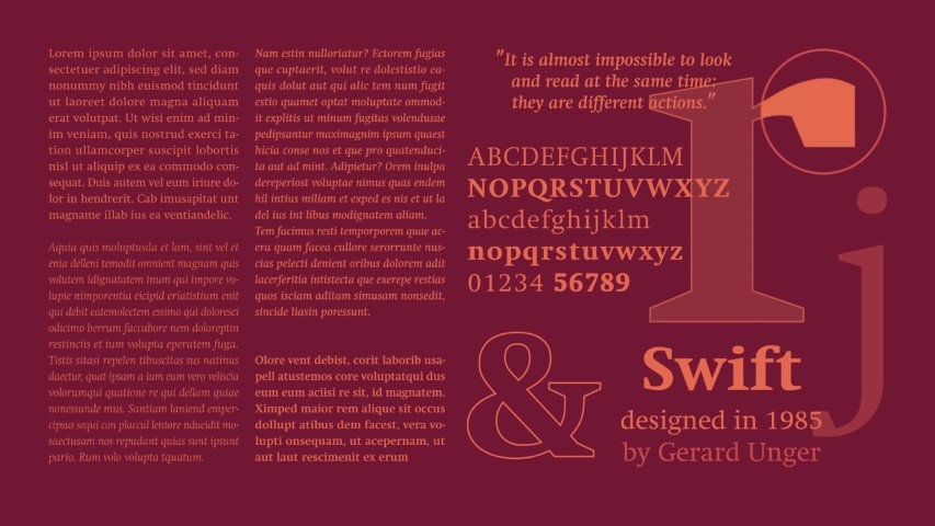
For around fifty years there was no proper development in newsprint typefaces and the two only available choices were Times New Roman and Excelsior. Swift, designed by Gerard Unger filled this niche also addressing the technological issues.
4. Ikarus system – the beginning of curves
The software that made it possible for encoding drawings as strings of ones and zeros, instead of manually turning on and off every pixel was named Ikarus. It was developed by the URW company in Germany in the early 70’s. Dr Peter Karow, co-founder of the company, was one with tremendous contribution of allowing the system to work with mathematical calculations of splines definitions. This meant that type was defined as curve shapes rather than just pixels which addressed the problem of bigger sizes. Ikarus was used to create digital typefaces as well as logos and signage. Three main problems to make type design widely available were the price of software and hardware and the complexity of use. Despite having a rather short moment of glory, Ikarus development left us with the interpolation. It was a base for later Multiple Masters technology as well as Variable fonts. The first public reveal of the Ikarus project took place in Warsaw during the 1975 ATypI conference.
5. Matthew Carter – Bitstream was when it started getting serious
Digiset and its variations were used until the introduction of the first Apple Macintosh in 1984, which brought typesetting to desktop publishing. The introduction of digital typography created a whole new range of possibilities and, of course, a tremendous need for the type design community to fill the void in the new market. In 1981, the first independent type foundry was established by Matthew Carter and his colleague Mike Parker. That startup, Bitstream, aimed to liberate designers from the realm of monopoly by machine industry corporations such as Monotype and Linotype. It was a turning point in typographic history, as the corporate approach to the digital realm revolved around the rapid delivery of familiar type solutions to the desktop platform in great numbers. This resulted in poor quality digital designs and repeated problems in further type design in general—we’ll come back to that a little later.
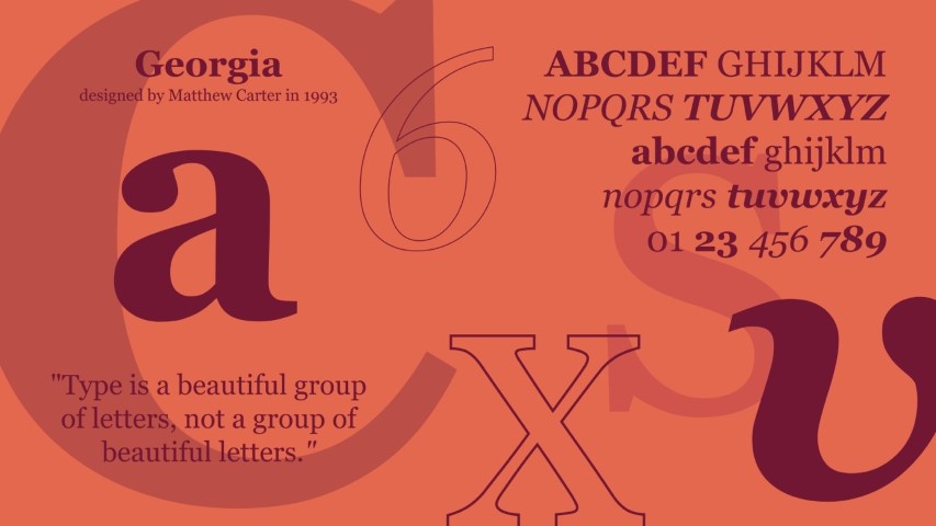
Matthew Carter, studied punchcutting, made letters for a variety of different medium and is a designer that is very much complete in terms of his skills and career, Georgia is a classical typeface created with the new technology prepared for screen display.
Bitstream digitally reproduced a wide range of classical, well known typefaces and released them under different names. Although not illegal, this practice caused a lot of controversy. Famously, Matthew Carter is one of the few type designers that has participated in the process of design using a wide range of technology. He studied punchcutting and produced his own punches, created typefaces for phototypesetting machines, designed type to be cut in wood, and pioneered digital type design for desktop computers. His designs include two of the most widely used typefaces in the world—Verdana and Georgia.
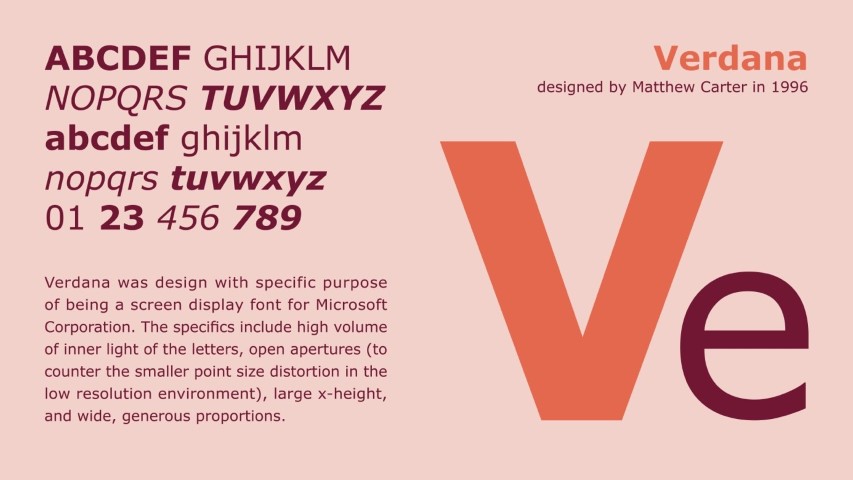
Verdana is one of the most widely used typeface on the planet. The reason is the language coverage. The concept was to design a screen typeface with maximum character legibility, that would survive extremely low resolution screens.
6. Sumner Stone, Robert Slimbach, and Carol Twombly – type design in its prime
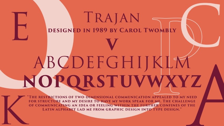
Trajan is a project that celebrates and honours one of the best achievement of our era – the Roman Capitals.
It was sketched and designed by Carol Twombly – a type designer of brief, but amazing career.
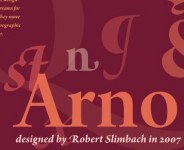
In the early 1990s, type design became more available to designers. Software tools accompanying hardware allowed for a wide range of possibilities and offered accessibility to those wanting to create their own designs. The number of solutions on the market grew exponentially. There are three more important names to mention at this point: Sumner Stone, Robert Slimbach, and Carol Twombly. Stone was the first director of typography at Adobe. He started the Adobe Originals “To create typefaces of extraordinary technical and aesthetic quality”3) while hiring Robert Slimbach and Carol Twombly in 1989. The program aimed to create timeless designs of the utmost quality both technical and aesthetic. Another major contribution of Sumner Stone was the Multiple Master technology4). It was based on the interpolation algorithm created by Dr Peter Karow and built on it to interpret the interpolation onto the desktop publishing. Few of the designs from the initial period include: Caslon (Twombly), Myriad with its serif counterpart Minion (Twombly and Slimbach), Trajan (Twombly), Arno (Slimbach). It is important to add that Slimbach and Twombly were not the only designers that contributed their work to the program and that it is still ongoing to produce a legacy of beautiful lettershapes.
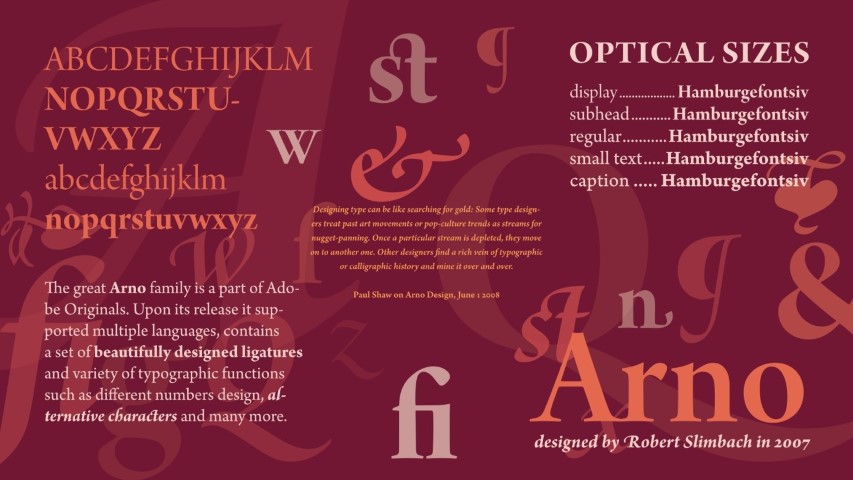
Arno Pro family by Robert Slimbach is a very modern yet classical desing. It has multiple extra features
such as a set of Optical sizes, a huge ligature collection and multiple options for numbers edition.
7. Font Wars – the dark side of the industry
To fully understand the transition from those early years in digital lettershapes to the abundance of typefaces today, one must be aware of the standards that changed over the years in what the industry called the “Font Wars.” Adobe based their releases on the adapted PostScript system. It defines typefaces and images as objects on a page. Adobe used the system to introduce PostScript Type 1. The significance of the standard is that it defines the lettershapes as outlines calculated as Bézier curves. Since Adobe had exclusive rights to this technology, Apple and Microsoft had to pay high licensing fees for the application and struggled to come up with an alternative of their own. In September 1989, TrueType (.TTF) was released. Meanwhile, Adobe offered a tool called Adobe Type Manager (.ATM) that had its own font format. While TrueType was created by Apple in collaboration with Microsoft, Apple independently developed the technology further and came up with QuickDraw GX. In response, Microsoft sided with Adobe to develop the OpenType font format (OTF). OpenType fonts began being released around the year 2000. As TrueType required advanced and detailed work to release a good quality product, it resulted in numerous examples of poorly designed typefaces and a reluctance to use it the format. Between 2005 and 2007, OpenType was adopted as a standard by the International Organization for Standardization (ISO). OpenType consists of four elements that come together as a font: outline description, hinting instructions (the way that the outline is pixelated on the screen in various sizes), tables for character classification, and extra features like substitution with alternate glyphs (including ligatures and numerous other possibilities).
8. The latest milestone – OpenType 1.8
This brings us to the introduction of OpenType 1.8 during the ATypI 2016 annual conference in Warsaw5). Although the change does not lie in the way that the typeface is constructed—good old Bézier curves are still the best choice—a new way of storing the information in the file and interpretation of multiple masters was brought to light: variable fonts. These two words comprise probably the most seen phrase at recent type design conferences and the typographic social media environment. What it comes down to is that a designer can create instances of a typeface that can be interpolated not only between themselves but even further, wherever the designer puts the limit. The problem today is that a font family that has, for example, five instances of weight, three optical sizes, and, let’s say, an extra serif and a regular and italic version of each means that we need 5x3x2x2 font files to have everything. That adds up to sixty instances to browse through in design software… with multiple font files to upload to a web server for use on a website. A variable font could contain a light and bold, italic, optical sizes, and a serif variation. Thanks to this new technology, they can all extrapolate to create countless instances seamlessly or only those defined by the designer.
OpenType 1.8 was a collaboration of industry—Apple, Microsoft, Adobe, and Google worked together toward a smooth introduction of the new standard. Between accepting OpenType as an ISO norm and this collaboration, the “Font Wars” came to an end. The weight shifted from trying to outrun the competition towards focusing on type design and the software engineering behind it to bring higher quality tools to type users. Both OpenType and the currently available tools for font creation allow for a much more detailed and advanced workflow which brings type design closer to what it was before the digital revolution began to make its mark on the world.
9. My point of view on the subject / Personal Thoughts
I decided to select a few of the many great designers and showcase their fonts from the beginning of the digital era that. In my opinion, these designs reflect best practices that should still be kept in mind while working on a type design project. Some might argue that this kind of thinking may be a bit skeuomorphic and modern solutions should be more rooted in their own digital realm. However, centuries of alphabetic evolution and the way that lettershapes are perceived are deeply rooted in cultural traditions. This is one of the reasons for a big difference in non-Latin scripts—they cannot directly adopt the same practices that are used for Latin as their cultural evolution has a different background.
10. Why is it important to use professional typefaces?
Even if you or your client have no budget for purchasing a font, not to mention commissioning a custom project, it is always better to stick to the ones that are professionally designed. Today, such services Adobe Typekit, MyFonts, Fontstand, and others provide affordable solutions, even for freelancers. If you must use free solutions, there is always Google Fonts. Choosing this kind of service in a way guarantees that for one, the work was done by a type designer, tested in multiple ways and environments for bug detection, and usually provides broader language coverage. The spacing between the letters (which is a sacred thing for the industry) is not incorrect.
Here are a few essential tips for working with typefaces:
- Do not tamper with the design to make it fit!
- In Adobe use Metric vs. Optical kerning (Metric—as designed, Optical—calculated by an algorithm)
- Be aware of possible OpenType features—good designs include numerous ligatures, substitution options, small caps, sub and superscripts, and variety of numbers for display, text, and table purposes.
- Keep in mind the original design destination of the typeface—if someone already did the work, there must be something to it.
- DO NOT TAMPER WITH THE DESIGN TO MAKE IT FIT!
11. What it all means for graphic designers and typographers?
A single OTF file can contain up to 65,535 characters and glyphs. This is an unimaginable number if you consider that the English alphabet holds a mere 26 letters. Let’s add punctuation marks and numbers, consider that there are upper and lower cases, small caps, subscript, and superscript… but then there are various languages that use extended latin characters. A wide range of extra characters called diacritics comes in the picture. Not to mention other scripts—Cyrillic, Greek, Hebrew, Arabic, Devanagari, Thai… Unicode, which is a standard of numbering each of the glyphs and characters mentioned above, allows for a neat organization of all. G graphic designers and typographers are given a powerful tool that extends greatly beyond the basic set of letters. The purpose of the whole story above is to illustrate that the meticulous process of designing a typeface is something not to be treated lightly. A designer must be aware of all the features of a chosen font and the circumstances that led to the design in the first place. Of course, that does not mean that there is no room for distortion or playing around with lettershapes; just that it should be done with reasoned intent. In the end, both type designers and graphic designers want to make the world a nicer place to look at in addition to the functional purposes served by design.
- https://www.youtube.com/watch?v=vNUEUth7qjc – the Selectric Machine
- https://typejournal.ru/en/articles/Gerard-Unger-Interview Gerard Unger—Type Journal Interview, 13.05.2015
- http://www.adobe.com/products/type/adobe-type-originals.html – Adobe Originals info page
- https://blog.typekit.com/2014/07/30/the-adobe-originals-silver-anniversary-story-how-the-originals-endured-in-an-ever-changing-industry/ – The Adobe Originals Silver Anniversary Story: How the Originals endured in an ever-changing industry – 7th of 10 amazing articles by Tamye Riggs about the Multiple Masters Technology
- https://www.youtube.com/watch?v=6kizDePhcFU – Presentation from the ATypI Warsaw 2016 revealing the major update in OpenType – the introduction of Variable Fonts
Other resources:
- https://www.typenetwork.com/brochure/decovar-a-decorative-variable-font-by-david-berlow#?skelID=SA&skel=1&termID=TA&term=1 – Decovar typeface presentation
- https://vimeo.com/191480482 – Zeitung Flex by Underware typeface video showcase
- https://medium.com/@jpamental/one-year-in-an-update-on-variable-fonts-7e3b9b716e49 – One year in an update on variable fonts by Jason Pamental
This article was written by Borys Kosmynka and commissionned by Pixartprinting.
No Comments⊕ Add a comment
No comments yet.
Leave a comment