An alphabet of buildings
We turn iconic buildings into letters of the alphabet in a game that reveals the very essence of these structures and the cities in which they are located.
“All language is an alphabet of symbols,” said Argentine genius Jorge Luís Borges in his book The Aleph. Let’s take this definition literally: what happens if we reduce the language of architecture to the letters of the alphabet? Representing a building’s shape with a letter makes us focus on its essence. It’s a mental exercise that says much about architecture and the places where it blossoms.
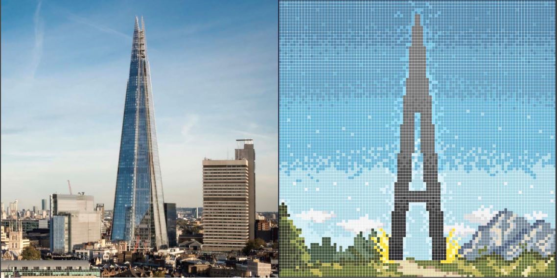
A: The Shard
The European Union’s tallest skyscraper (London’s Shard: 309.6 metres high, with 95 storeys) resembles the sharp tip of the letter A. “I hate tall buildings,” said architect Renzo Piano when it was suggested he build it. But then Piano thought of the spires of London’s churches and the ships’ masts painted by Canaletto, and changed his mind. To erect the Shard, hundreds of workers braved sub-zero temperatures, gale-force winds and a Thames flood. But just as the letter A marks the start of the alphabet, the Shard started a new way of living: a vertical city, with offices on the lower floors, restaurants and a hotel on the middle floors, and apartments on the upper floors. It’s an example of the limitless ambition of the city over which this building towers.
H: The Palácio Nereu Ramos
The two hemispheres of the Brazilian parliament – the concave Senate, symbolising togetherness, and the convex Chamber of Deputies, symbolising openness – are the most iconic shapes within the Palácio Nereu Ramos, built in 1960 in Brasilia by Oscar Niemeyer. But between them rises the so-called Annex 1: twin, 100 metres-tall towers connected by bridge, creating an H shape. The letter’s pair of uprights, which capture the fundamental form of the building, highlight Niemeyer’s desire to give it “a monumental character by simplifying elements and adopting pure, geometric shapes.” The Palácio Nereu Ramos is the symbol of Brasilia, Brazil’s futuristic capital built from scratch in the middle of the rainforest in the 1960s.

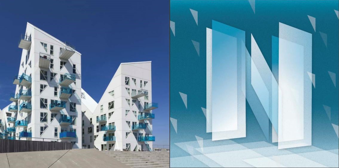
N: Isbjerget
Viewed from a certain angle, it’s not dissimilar to the little houses with pitched roofs typical of Danish ports. But from almost every other angle, this building looks like an enormous block of floating ice, with its uneven surface and blue and white hues. Perhaps that’s why its profile resembles the letter N, with two neat vertical bars linked by a steep diagonal. Designed in 2013 by four architecture firms in Aarhus, Denmark, the structure has up to 10 floors in some places. As well as having an evocative shape, its uneven surface affords superb views from almost all of the 200 apartments in the building. A blend of beauty and functionality typical of Nordic culture.
E: Fuji Television’s headquarters
Three long “sky corridors” connecting the two towers of Fuji Television’s headquarters in Japan make the building look like an E. Built by Kenzo Tange in Tokyo in 1997, the structure resembles something from a sci-fi film like Blade Runner or Ghost in the Shell. And not just because of its titanium exterior and enormous sphere some 100 metres up. The building’s very structure was designed to house the most advanced telecommunications technologies. But without forgetting that at the core of a communications company lies creativity, not technology. Indeed, the corridors and sphere were designed as spaces to meet informally and bring together the different parts of the company.

X: Statoil offices
The 140-metre-long, 23-metre-wide and 3-storey-high strips of Statoil’s Oslo HQ cross over to create a gigantic X. Like the letter, the building’s long branches extend in different directions. It’s not just a striking artistic concept: this structure gives the 2,500 people who work there stunning views of the Oslo fjord and plenty of natural light: Nordic democracy in practice. Designed by architects A-lab in 2012, the building’s form and finishes also make it highly sustainable: an important statement coming from an energy company.

M: Reggio Emilia railway station
A giant, 483-metre-long white wave rises in the middle of northern Italy’s Po Valley. It’s the Reggio Emilia railway station, designed by Santiago Calatrava in 2013. Its undulating shapes resemble the peaks and valley of the letter M. The station is part of a series of structures that includes several bridges and a motorway toll station, all designed by the Valencian architect and known colloquially as “Calatrava’s sails”. The only stop for high-speed train services between Bologna and Milan, the station is a spectacular landmark slap bang in the middle of the Po Valley plain.

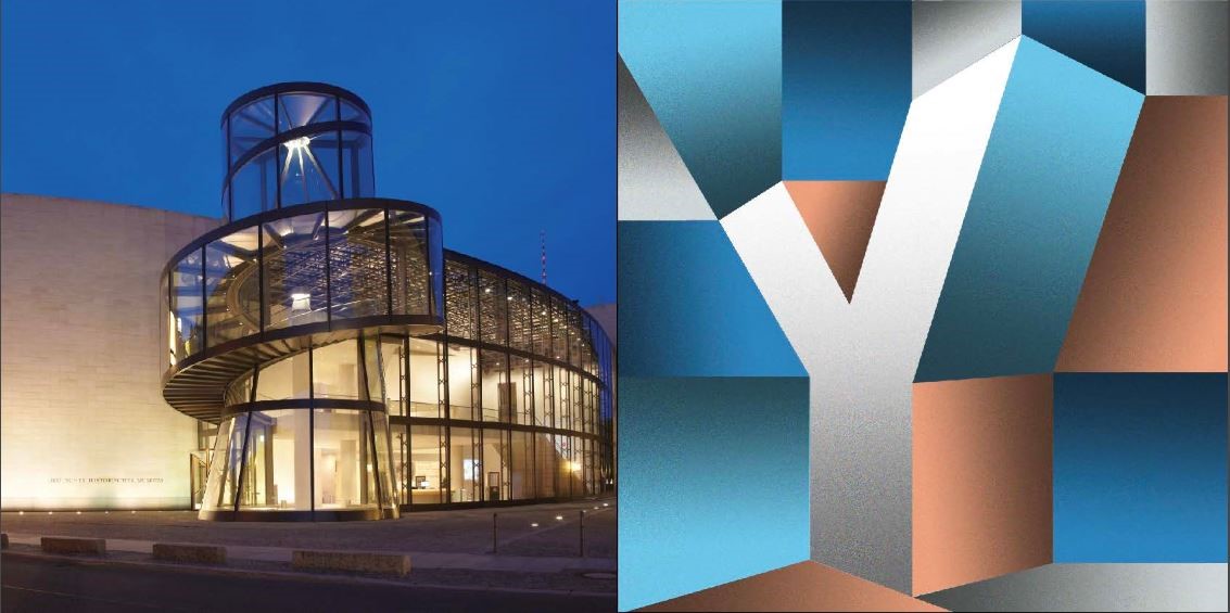
Y: Deutsches Historisches Museum
“The architecture of this structure should seduce people, and encourage them to roam around the building filled with curiosity and delight.” So architect Ieoh Ming Pei described the wing he designed in 2009 for Berlin’s Deutsches Historisches Museum. The building is devised to bring together the ancient and the modern, with the German capital’s typical ambivalence: by night, it’s a bright, ultra-modern treasure chest; by day, it reflects the surrounding historic buildings. Its upside-down Y-shape embodies the idea of bifurcation intrinsic to this letter: a crossroads between the past and the present, and between the different itineraries visitors can choose. Together with the Louvre pyramid, this work underlines the important contribution that Pei has made to museum architecture.
Q: Markthal Rotterdam
Can a structure be open and closed at the same time? Yes, judging from the design by architects MVRDV for Markthal Rotterdam, the largest covered market in the Netherlands. Built in 2014, this structure bends two parallel buildings into each other to make one. The covered space in the middle is occupied by a market. Viewed from afar, the building looks like a sort of Arc de Triomphe, but in fact each opening is protected by a glass grid supported by steel cables. The building actually seems like an O – a closed circumference – or a section of pipe open at both ends. But in reality, the most appropriate letter is Q, because the structure continues sideways underground, to create a space that houses a delivery area and warehouse.

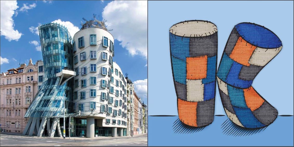
K: Dancing House
The letter K is the combination of a straight vertical line with another line angled in the middle. These are also the main formal elements of the Dancing House in Prague. Seeing in the structure two dancers, architect Frank Gehry, who designed the building with Czech colleague Vlado Milunic in 1996, took to calling it “Ginger and Fred”. The two co-existing parts, one static, the other dynamic, the yin to the other’s yang, were intended to symbolise the transition of Czechoslovakia (today split into two separate states) from communism to democracy. The contrast of this avant-garde structure with the area’s prevailing classical style is another example of this principle.
S: The Sydney Opera
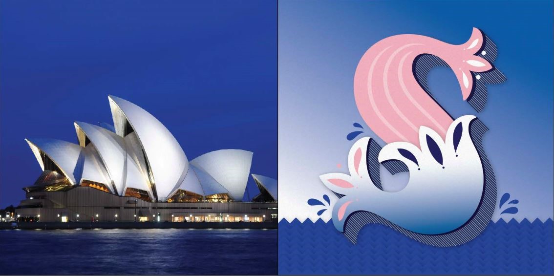
The Sydney Opera House epitomises iconic architecture. Its architect, Jorn Utzon, was awarded the Pritzker Prize (architecture’s equivalent to the Nobel prize) in 2003 and the structure was declared a UNESCO World Heritage Site in 2007. But when the building opened in 1973, it did so amidst a storm of controversy. It was 15 times over budget and some of its structures had to be rebuilt to bear the weight of the enormous concrete “shells” resting upon it. But Utzon’s dream – to fashion gigantic white sails that would stand out against the blue sea below – became reality. Ever since, the building has stood like the decoration of a handwritten letter S, an integral part of Sydney’s image.
This article was written by Pixartprinting and illustrated with lettering by Martina Flor.


 January 21st, 2018
No Comments⊕ Add a comment
No comments yet.
Leave a comment