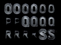
I don’t know how he achieved to do this, but Cameron Zotter did a great job with his ice typography experiment.
It’s not the same alphabet but I guess he used something like this: http://shoponline.muji.fr/product_info.php?cPath=16_171&products_id=3406&osCsid=8113c56080379d2443e33557a6fe97d3 I really like the fading effect.
Name (required)
Mail (will not be published) (required)
Website
Δ


 February 18th, 2011


It’s not the same alphabet but I guess he used something like this: http://shoponline.muji.fr/product_info.php?cPath=16_171&products_id=3406&osCsid=8113c56080379d2443e33557a6fe97d3
I really like the fading effect.