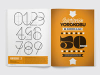
For the April 2012 edition of the Yorokobu magazine, Wete created this cool illustrative font.
I like it but why is the 5 upside-down?
Name (required)
Mail (will not be published) (required)
Website
Δ


 June 6th, 2012
I like it but why is the 5 upside-down?