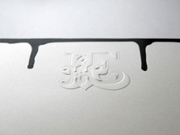
Awesome use of printing techniques in this beautiful corporate identity for Ben Eine.
it’s gorgeous, but from an informational design standpoint, isn’t it a bit too obtuse? i cannot discern from the pieces just what the business is or does. is it painting? the emboss is nice, but what *is* it?
Name (required)
Mail (will not be published) (required)
Website
Δ


 October 30th, 2011


it’s gorgeous, but from an informational design standpoint, isn’t it a bit too obtuse? i cannot discern from the pieces just what the business is or does. is it painting? the emboss is nice, but what *is* it?