

The font for people with dyslexia
 July 18th, 2011
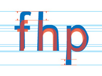
If you needed examples of the crucial role typography plays in reading, the Dyslexie font should convince you. This font was created for a specific purpose, making it easier for people with dyslexia to read without errors.

Thanks to some changes to make letters look less alike, height and width changes and much more, the results are good and studies show that the font makes reading easier for people with dyslexia.


Thank you for the information. I always knew there was a difference in how dislexics saw letters, but it is great to know how they see them. Important discovery that will help many, many people. Good work.