INVSBLE’s identity is so minimalist that they took some letters out
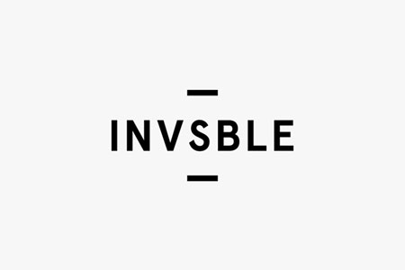
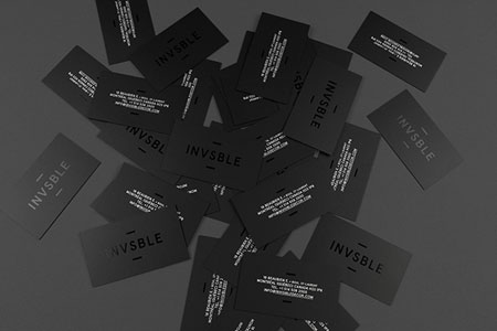
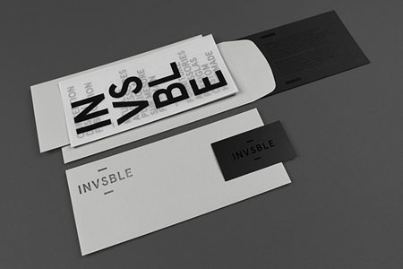
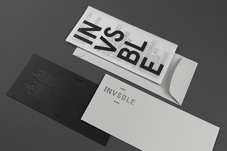
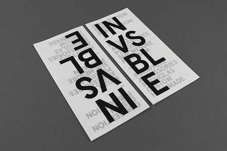
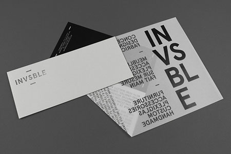
In the choice of its name and spelling, INVSBLE boutique already opted for a minimalist approach. The visual identity that follows is just as minimalist and workd extremely well. It works even better on the small brochure, thanks to the printing on transparent paper.
This identity was designed by Montreal-based designers Emmanuel Cohen and Justin Lortie, who published it on Behance.


 March 16th, 2015
No Comments⊕ Add a comment
No comments yet.
Leave a comment