

XYZ Type releases Aglet Sans, a sleek new companion to Aglet Slab
 April 20th, 2019
Independent type foundry XYZ Type has released a new typeface drawn by Jesse Ragan: Aglet Sans, which forms a superfamily with the earlier Aglet Slab.
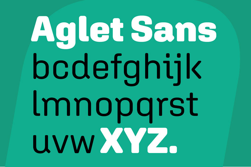
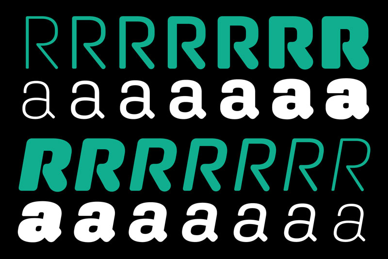
A well-designed rounded typeface needs more than just a filter applied to it—it needs circles in its DNA. Both Aglet Sans and Aglet Slab view roundness as a fundamental structural element rather than mere embellishment or afterthought. Modular shapes and a lively interplay of different corner radiuses provide a dynamism that offsets the strictures of other forms, urging the eye forward. Both typefaces consist of seven weights with corresponding italics and extensive symbols designed to match each weight. The Extra Light is almost like a wireframe of the characters, which become more varied and complex as they grow heavier.
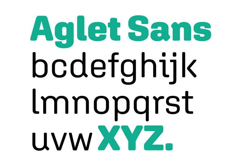
Yet Aglet Sans also stands decidedly on its own. Ragan hasn’t simply lopped off serifs—he has thoroughly and sensitively redrawn the face. An absence of serifs makes the disconnected R, K, and k more conspicuous. The unique entrance and exit strokes of i, j, and l play off the jaunty 45-degree-angled entry strokes of n, m, p, and r, creating fascinating interactions of form and counterform. Aglet Sans is perfect for text down to 12 points in print and 14 pixels on the web, while it retains enough verve and idiosyncrasy to perform well in decks, headlines, and even larger display settings or environmental graphics.
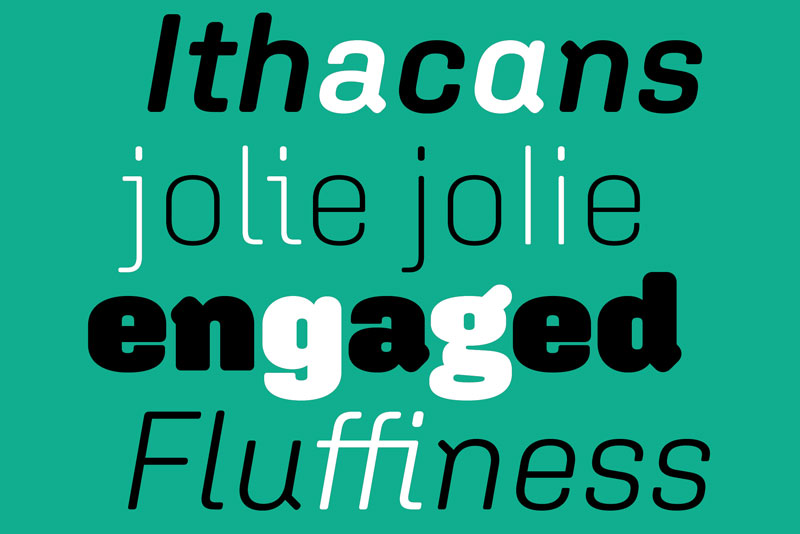
Other features include an extensive set of thoughtful symbols designed to match each weight, including arrows, ballot boxes, checkmarks, and stars. The glyph set also contains alternates for g and a; simplified versions of i, j, and l; standard ligatures; proportional and tabular lining figures; and arbitrary fractions.

Aglet Sans, a technical face with a human touch, is now commercially available for desktop, web, and apps directly from xyztype.com, as well as through distributors Fontstand and Type Network. Use it solo or with its slab sibling.
No Comments
No comments yet.
Sorry, the comment form is closed at this time.