A Line-based Symbol for Gymondo’s Visual Identity
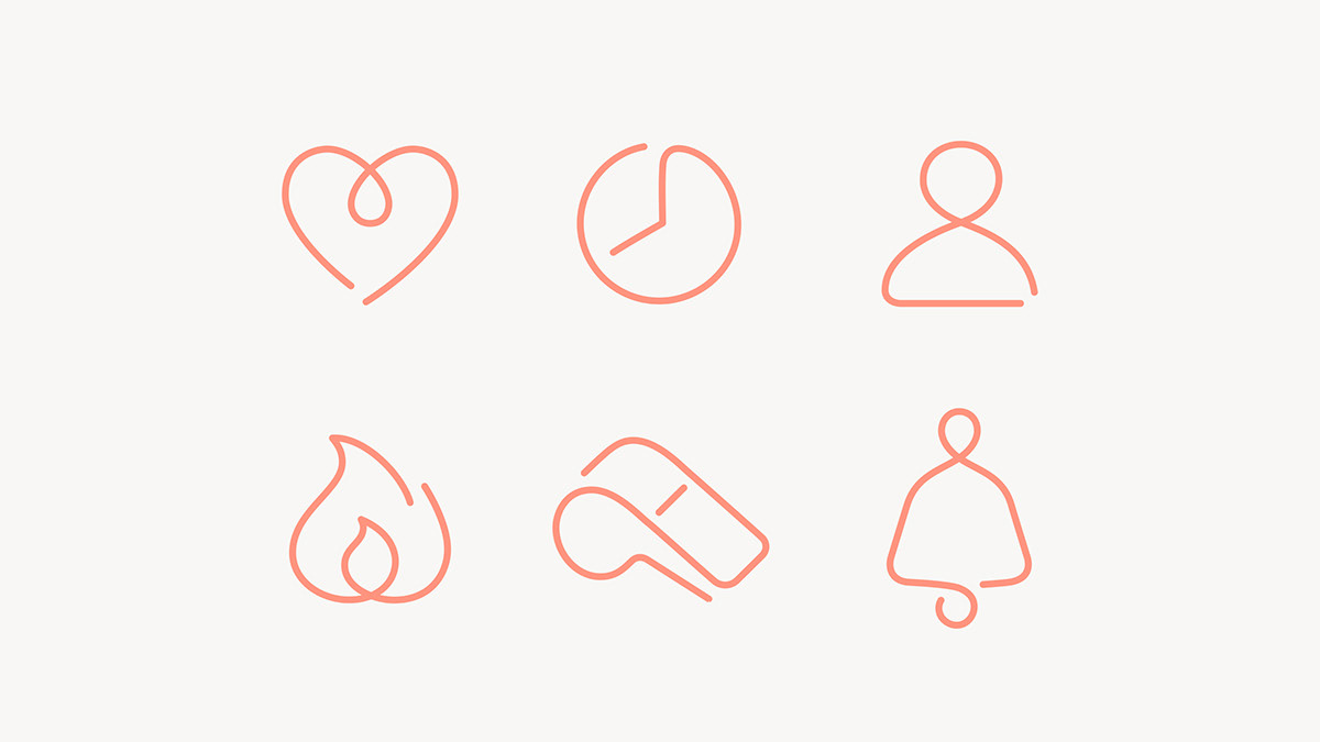
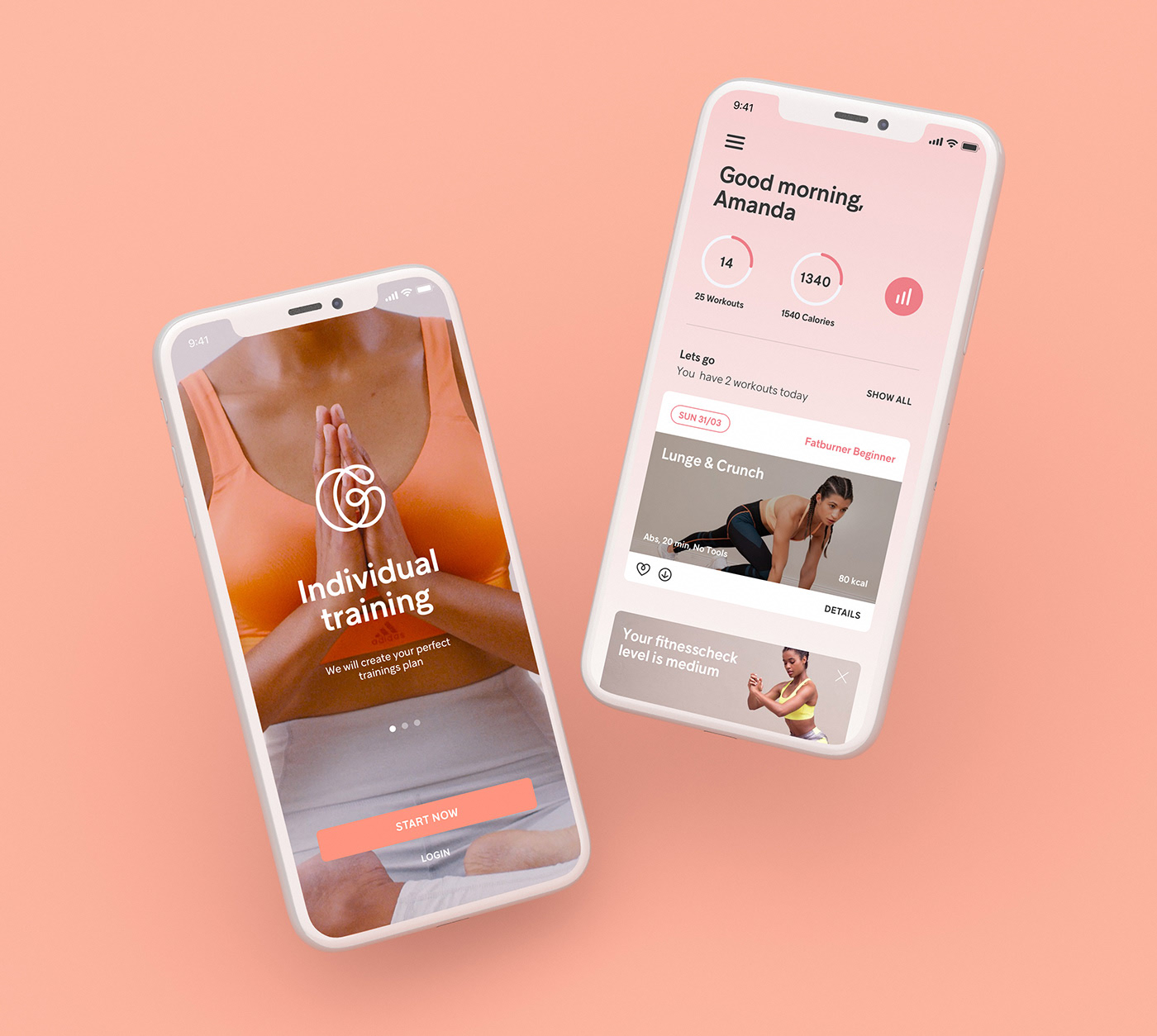
A bright rebranding for Germany’s number one fitness service. The thin lines and subtle colors give the logo a very energetic and positive vibe. The line shapes used in the icons are also found everywhere in the visual elements.
This project was a collaboration between Werklig, Jenni Pasanen, and Lili Köves.


 June 7th, 2019
No Comments
No comments yet.
Sorry, the comment form is closed at this time.