

Exploring Isometric Typography: A Grid-Based Design Approach
 July 31st, 2025
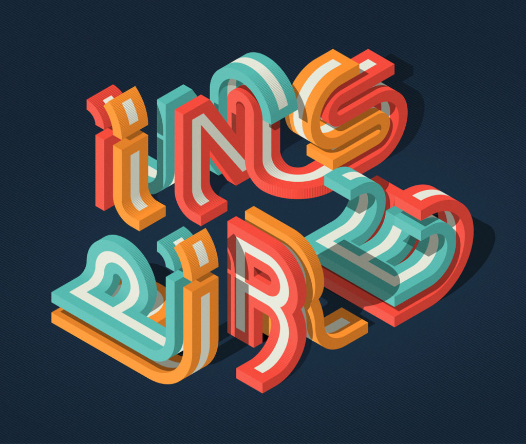
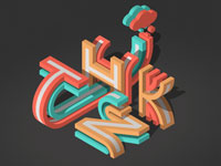
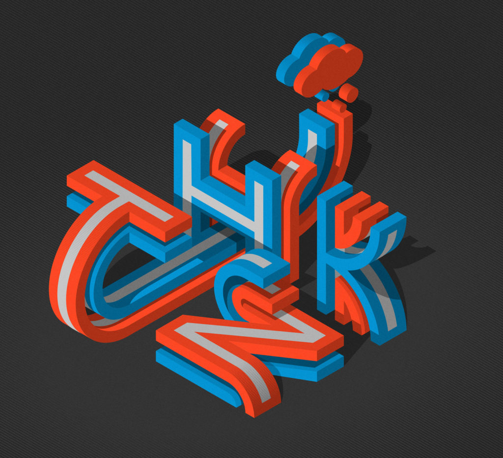
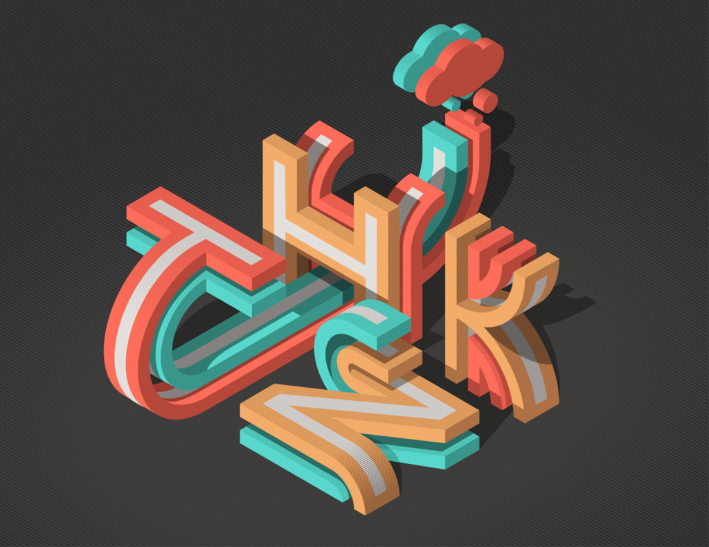
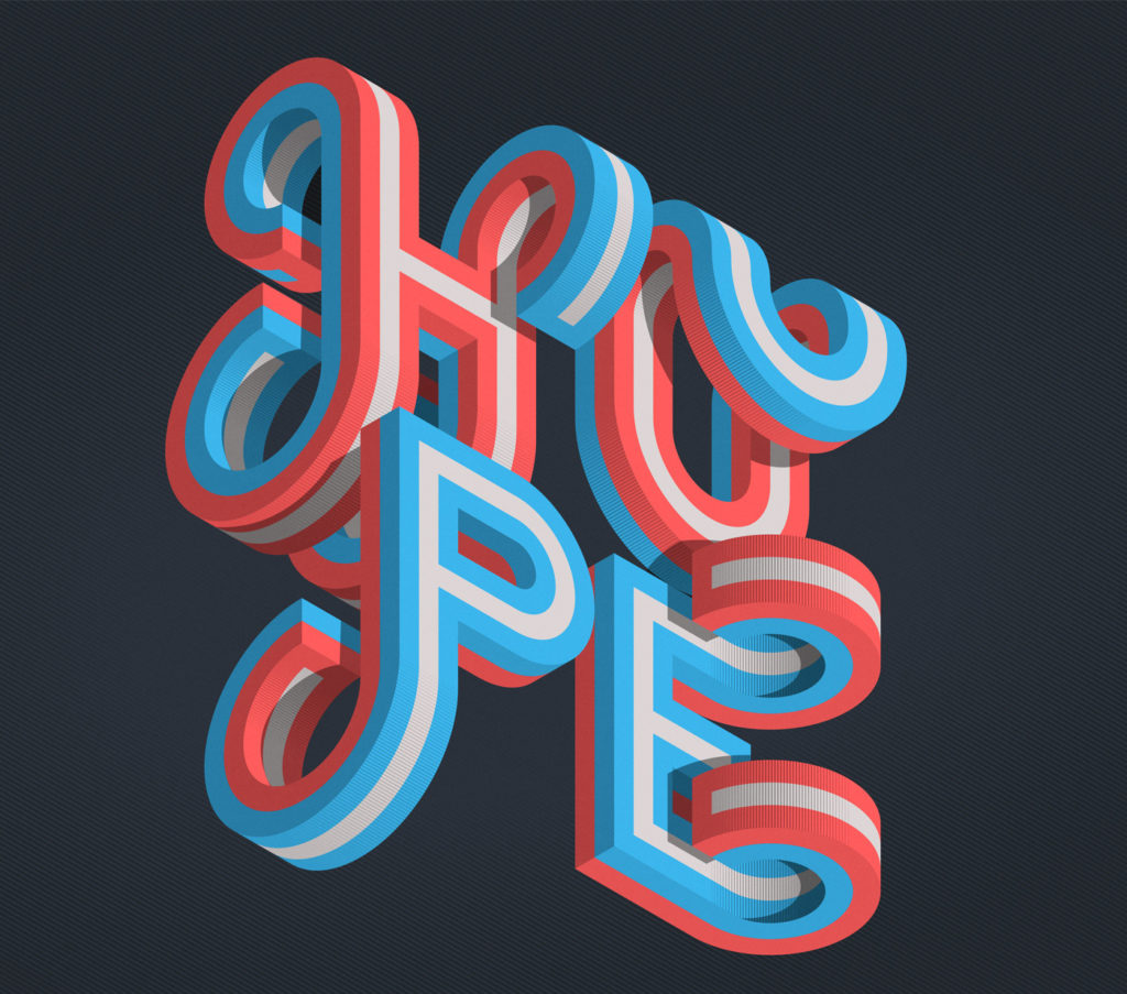
Typography is more than just arranging letters—it’s about shaping visual experiences. In this post, we dive into an intriguing typographic experiment by Mario de Meyer: isometric grids as a foundation for letterforms. This technique blends structure and creativity, offering a fresh perspective on dimensional type design.
The Power of Isometric Grids in Typography
Isometric grids provide a 3D illusion on a 2D plane, using consistent angles (typically 30°) to maintain perspective without distortion. When applied to typography, these grids introduce depth, dynamism, and a playful architectural quality.
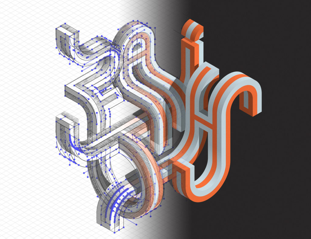
The project featured here demonstrates how rigid geometric constraints can fuel creativity. Each letter is constructed within the grid, balancing uniformity with artistic expression. The result? A cohesive yet vibrant series where type becomes a sculptural element.
Key Design Takeaways
- Structure Meets Flexibility – The grid ensures consistency, but subtle variations in shading, line weight, and negative space give each character personality.
- Depth Through Simplicity – Even without complex rendering, the isometric perspective creates striking dimensionality.
- Scalability – This approach works for logos, posters, or digital art, proving that systematic design can adapt to diverse applications.
How to Experiment with Isometric Typography
- Start with a Grid: Use tools like Illustrator’s grid tools or free isometric templates.
- Sketch First: Roughly plot your letterforms within the grid before refining digitally.
- Play with Details: Add texture, color, or transparency to enhance the 3D effect.
Why It Matters
Isometric typography challenges designers to think beyond flat layouts. It’s a reminder that constraints—like a grid—can spark innovation rather than limit it. Whether for branding, editorial work, or pure experimentation, this method offers endless possibilities.
Inspiration for Your Next Project? Try breaking down a typeface into isometric components or morphing glyphs into geometric structures. The intersection of precision and imagination is where the magic happens.
No Comments
No comments yet.
Sorry, the comment form is closed at this time.