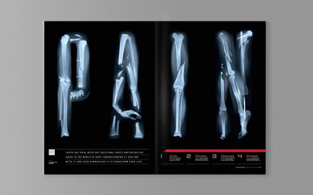
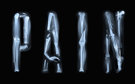
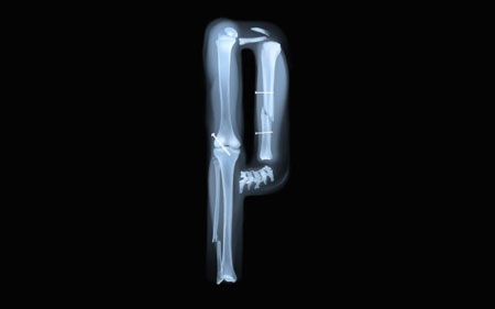
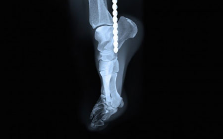
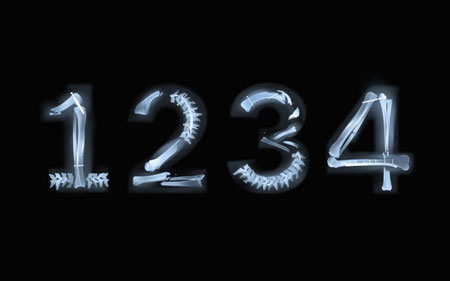
A painful alphabet created for Men’s Health magazine
Sawdust is a design studio composed of two talented graphic designers, Rob Gonzalez and Jonathan Quainton. The two creatives have often been awarded for their typographic and branding work.
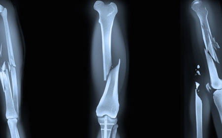
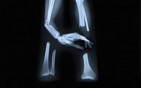
Their typographic project for Men’s Health magazine strikes gold once again. The X-rays of broken words re-composed in letters will just make the readers scream.




 March 16th, 2015
No Comments⊕ Add a comment
No comments yet.
Leave a comment