Branding for Saastamoisen saatio
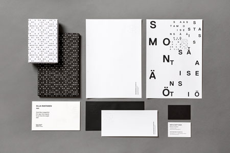
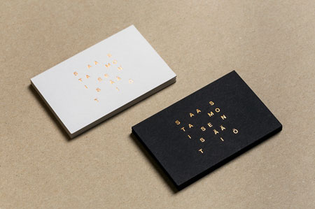
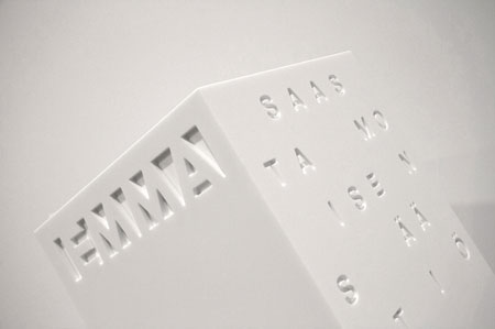
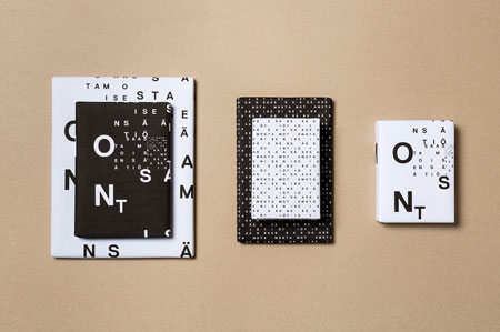
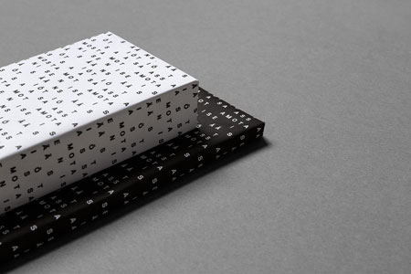
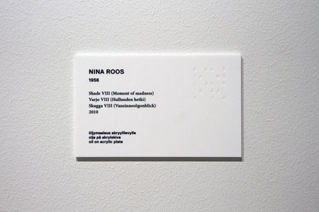
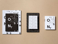
This art collection from Finland with an unpronounceable name just got its corporate identity after existing for almost 50 years. With more than 2’500 pieces, it’s one of the largest collections of Finland. The identity is purely typographic and kind of experimental, with an interesting display of letters arranged in a grid. Designed by Tony Erapuro and Kuudes Kerros.




 September 1st, 2015
No Comments⊕ Add a comment
No comments yet.
Leave a comment